Sample Report - Example Only

Diagnostic Drawing Series (DDS)

Try This Test - Free
Example drawing: Diagnostic Drawing Series (DDS)
First Opening · Overview Letter

Read the whole drawing as the first letter

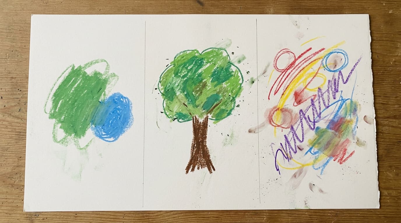
The three panels show complete task engagement, moving methodically from an initial abstract pairing to a fully realized central tree, and finishing with an expressive multi-element composition.

Color variety and stroke dynamics expand steadily across the series, indicating an adaptable visual repertoire that shifts in response to differing instructions.

Formal elements provide rich material for personal inquiry regarding pacing, boundaries, and emotional expression, though they do not authorize clinical diagnoses or fixed trait conclusions.

Observation before interpretation

Visible clues 1-5

  1. Clue 1Panel 1 features a green textured oval next to a blue sphere surrounded by open white paper.
  2. Clue 2Panel 2 presents an upright, centered tree with a textured brown trunk and layered green foliage.
  3. Clue 3Panel 3 combines red and blue circles, yellow arcs, purple zigzags, and a blended multicolor field.
  4. Clue 4The palette broadens across panels from cool duo-tones to earthy greens and a vibrant five-hue spectrum.
  5. Clue 5Stroke styles transition from soft textural fills in panels 1 and 2 to crisp angular paths in panel 3.

Letter 1

A Letter on Starting Simple and Guarding White Space

How deliberate pacing creates room for clarity

Your opening panel begins with two clean color shapes resting comfortably in generous white space. One possibility to test is whether you value having clear breathing room before committing to complex endeavors. Alternatively, this may simply reflect a momentary aesthetic choice to explore pastel texture without overcomplicating the page. In work meetings or conversations, notice if you feel most grounded when discussions begin with a clear, minimal agenda.

Protect morning whitespace

  1. Identify one complex task planned for tomorrow morning.
  2. Spend the first ten minutes organizing only the essential materials before writing or building.

Testing a calm, minimal opening gives you firsthand insight into how space shapes your focus.

Starting simple gives me the breathing room I need to see where things should go.

Letter 2

A Letter on Finding Grounding in Familiar Structures

Balancing clear boundaries with internal depth

When asked to draw a tree, you constructed a centered, upright figure with a solid trunk and multifaceted green foliage. This suggests a capacity to find comfort in well-understood frameworks while enriching them with subtle internal texture. On a practical level, it could also reflect familiar artistic habits from school or past hobbies. Consider whether you do your best work when goals and core expectations are plainly established.

Clarify a structural anchor

  1. Choose a current project that feels ambiguous.
  2. Write down its two non-negotiable structural parameters on a single index card.

Explicit boundaries reduce cognitive strain and clarify the space available for creative choice.

Having a clear structure actually frees me to be more inventive within it.

Letter 3

A Letter on Giving Voice to Contrasting Energies

Letting structure meet expressive momentum

In the feeling drawing, your marks shift into dynamic linear rhythms: sharp purple zigzags intersect with soft yellow arcs and circular boundaries. This visual contrast may invite reflection on how you hold multiple, differing energies at the same time—such as precision alongside excitement. Alternatively, it might simply be an enjoyable experimentation with the full range of pastel strokes. Notice whether you welcome moments when diverse perspectives liven up a team discussion.

Map your current energies

  1. Take a blank scrap of paper and sketch two contrasting lines: one sharp zigzag and one smooth curve.
  2. Label each line with one feeling or demand currently present in your week.

Externalizing mixed feelings helps validate diverse demands without forcing them into artificial harmony.

I can hold both structure and lively energy without needing to choose between them.

Letter 4

A Letter on Expanding Your Palette Over Time

How warming up unlocks fresh expressive options

Your color choices grow markedly as you advance through the panels, starting with blue and green, settling into natural tones, and then welcoming red, yellow, and purple. This progression can illustrate a warm-up style where initial reserve naturally gives way to broader expressive variety. Non-psychologically, it may simply show that using more pastels became more appealing as you handled the medium. Reflect on whether you typically prefer a warm-up phase before opening up in social or creative gatherings.

Plan a low-pressure warm-up

  1. Before your next important conversation or creative task, allocate five minutes for informal warm-up thoughts.

Allowing yourself an intentional runway makes deeper engagement feel effortless.

I do my best when I give myself permission to warm up before going all in.

Letter 5

A Letter on Shifting Gears Between Softness and Edge

Discovering different gears for different tasks

The mark-making shifts noticeably across the sheet, moving from gentle, blended fills in the tree to energetic, angular linear paths in the final panel. This visual versatility highlights an ability to switch gears depending on what the moment calls for. On the other hand, it may reflect the physical pleasure of varying stroke pressure on rough paper. In your everyday life, notice how smoothly you transition from contemplative, quiet tasks to fast-paced, decisive action.

Notice your gear shifts

  1. Set a gentle reminder midway through your day.
  2. Check whether your current activity needs a soft, reflective approach or a decisive, crisp tempo.

Awareness of your working pace lets you adjust your tempo intentionally rather than by default.

Knowing when to be gentle and when to be direct makes all the difference.

Questions for you

  1. How does the progression from a simple two-color start to a multi-color finish match how you enter new situations?
  2. When you look at the centered tree, what daily routines or relationships currently provide that kind of grounding for you?
  3. Which element in the third panel feels most familiar: the enclosed circles, the sweeping arcs, or the energetic zigzag?
  4. What might change if you gave yourself a few extra minutes of quiet warm-up time before high-stakes tasks?
  5. If you were to create a fourth panel today, what colors or mark styles would feel most natural to add next?

How this report is built

Evidence strength: The Diagnostic Drawing Series provides standardized formal observation criteria, but empirical research cautions that graphic features cannot serve as standalone indicators of personality or clinical status.

Where the evidence stops

  • Published normative data derive largely from clinical group comparisons and cannot be applied deterministically to an individual drawing.
  • Drawing choices are influenced by artistic background, cultural conventions, material familiarity, and immediate setting.
  • Formal features provide reflective starting points rather than diagnostic measurements.

Mixed or null findings

  • Early protocol literature proposed specific diagnostic color and space correlations, whereas subsequent methodological reviews emphasized substantial individual variation and low cross-context validity.

Sources and context

  1. The diagnostic drawing series: A systematic approach to art therapy evaluation and research1988DOI
  2. Reliability and validity tests of the diagnostic drawing series1993DOI
  3. The Scientific Status of Projective Techniques2000DOI